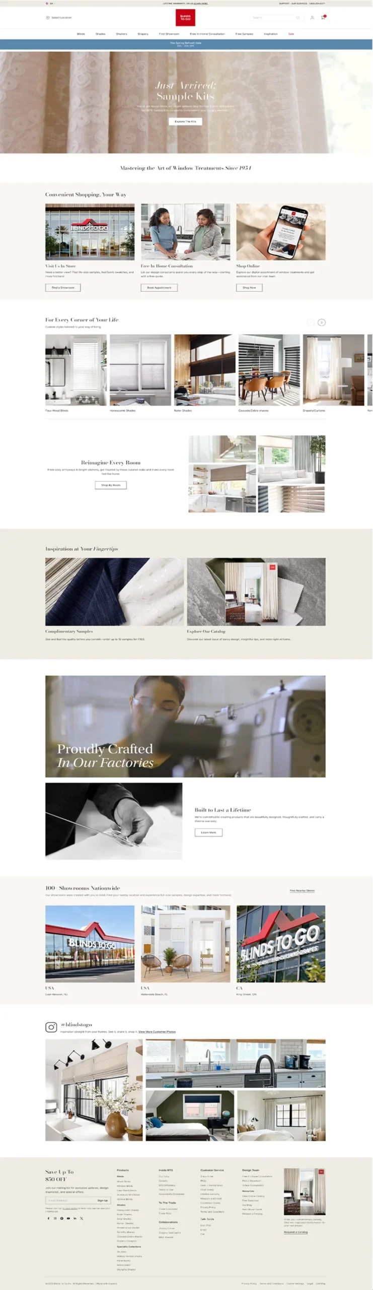
01
Lands on Homepage
First-time visitor arrives with mixed intent — shopping online, booking a consultation, or requesting swatches. They need immediate direction.
Previous Experience
Promotions dominated the homepage. Competing visual priorities slowed decision-making and weakened high-intent conversion paths.
Design Insight
Customers don't think in product categories — they think in spaces and immediate needs. Entry points needed to reflect how they actually shop.
Solution
Established four clear primary pathways: Shop Online, Shop In-Home, Find a Store, Free Swatches. Reduced promotional dominance to protect high-intent routes.
Promotion overload
Clear entry points
Reduced competing actions
02
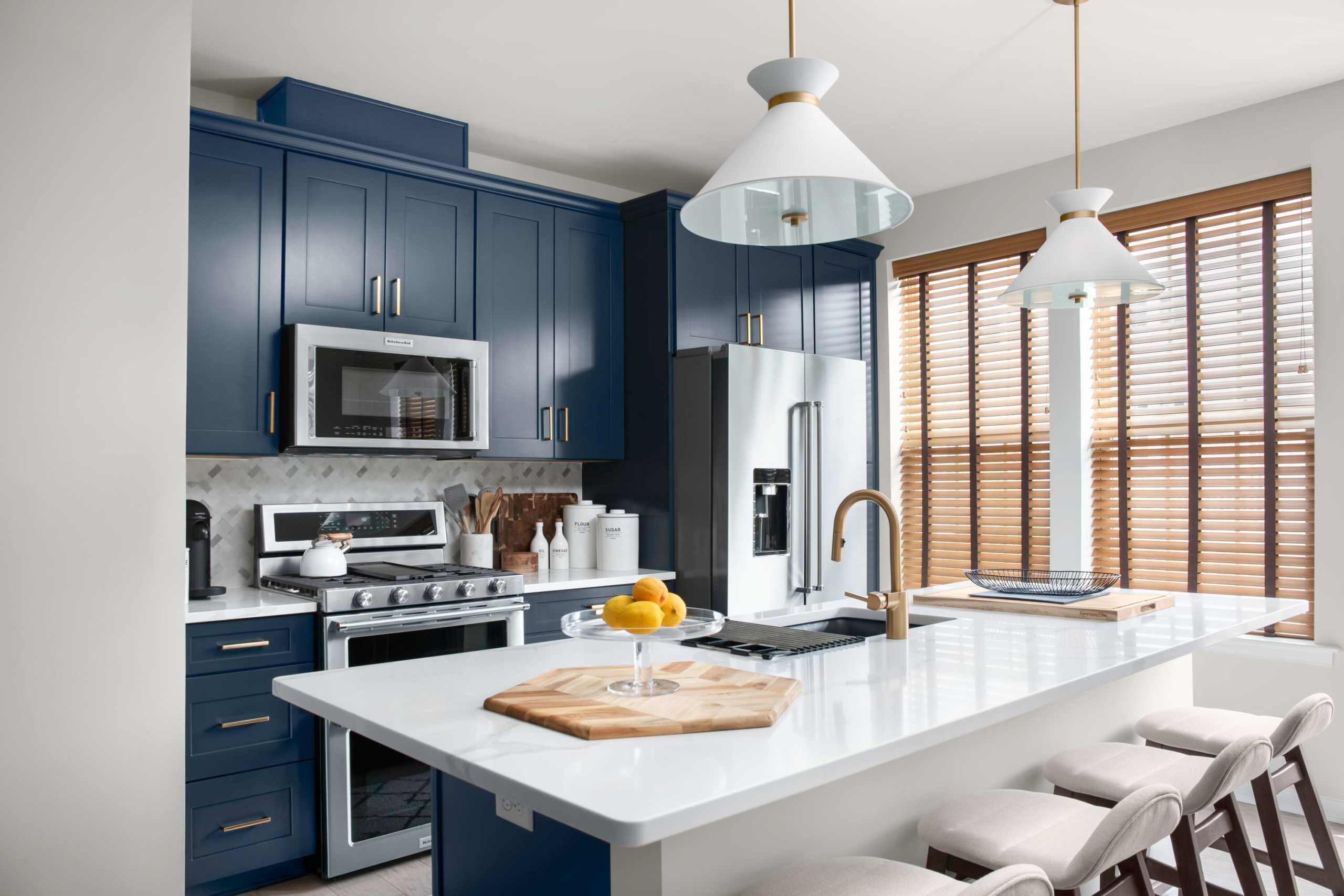
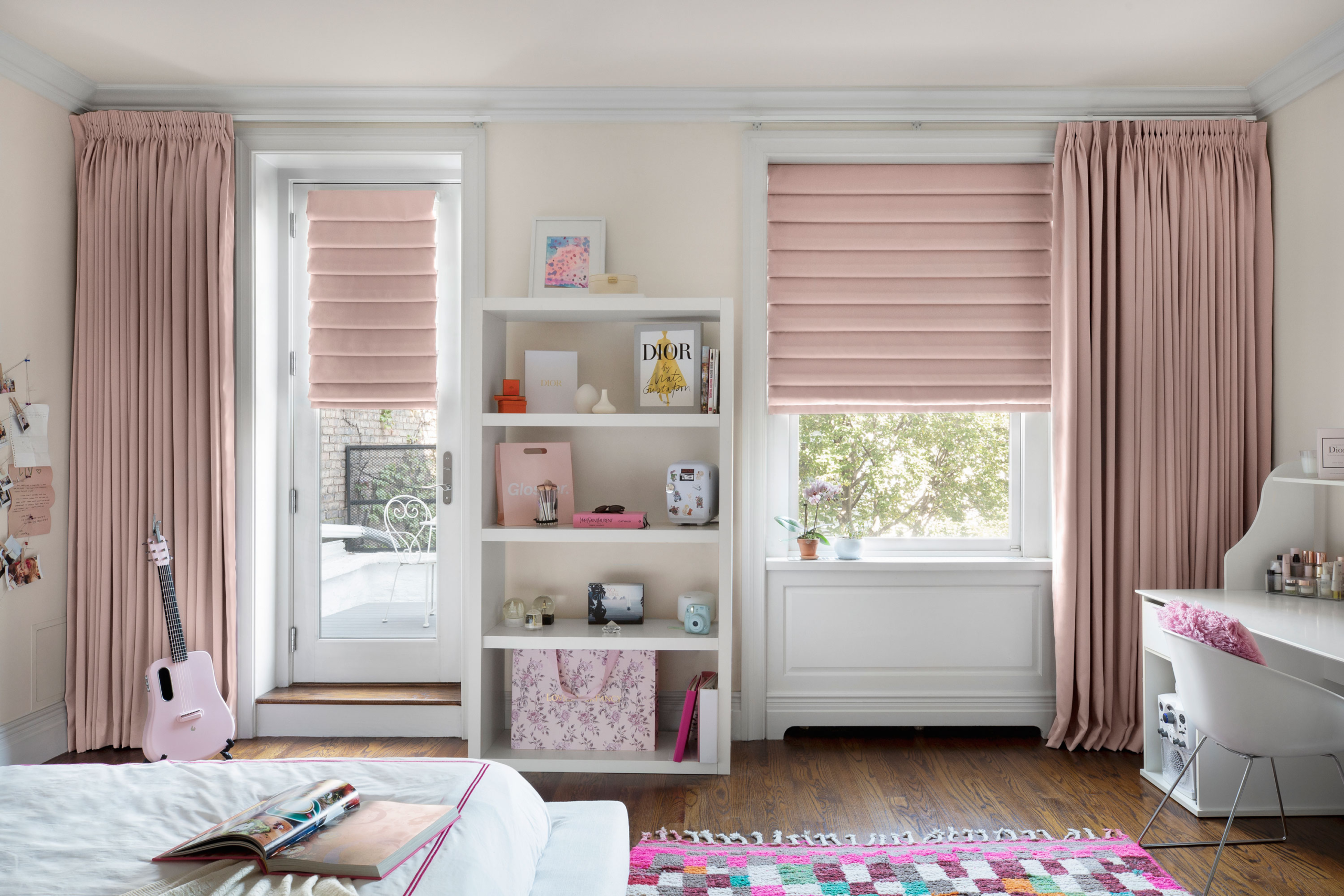
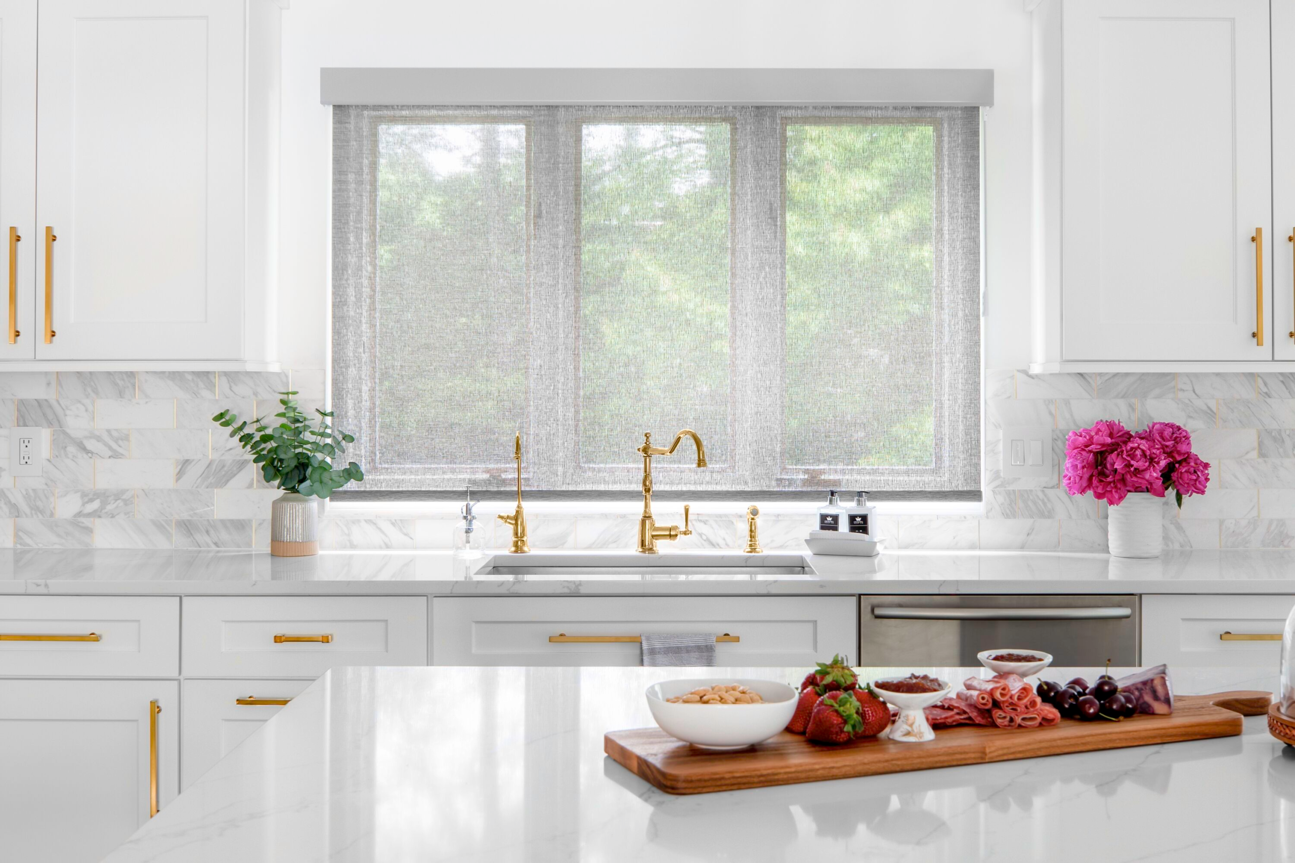
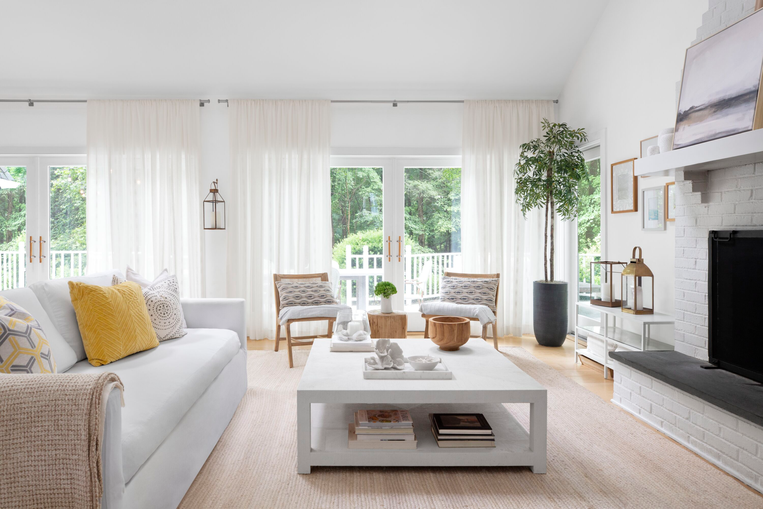
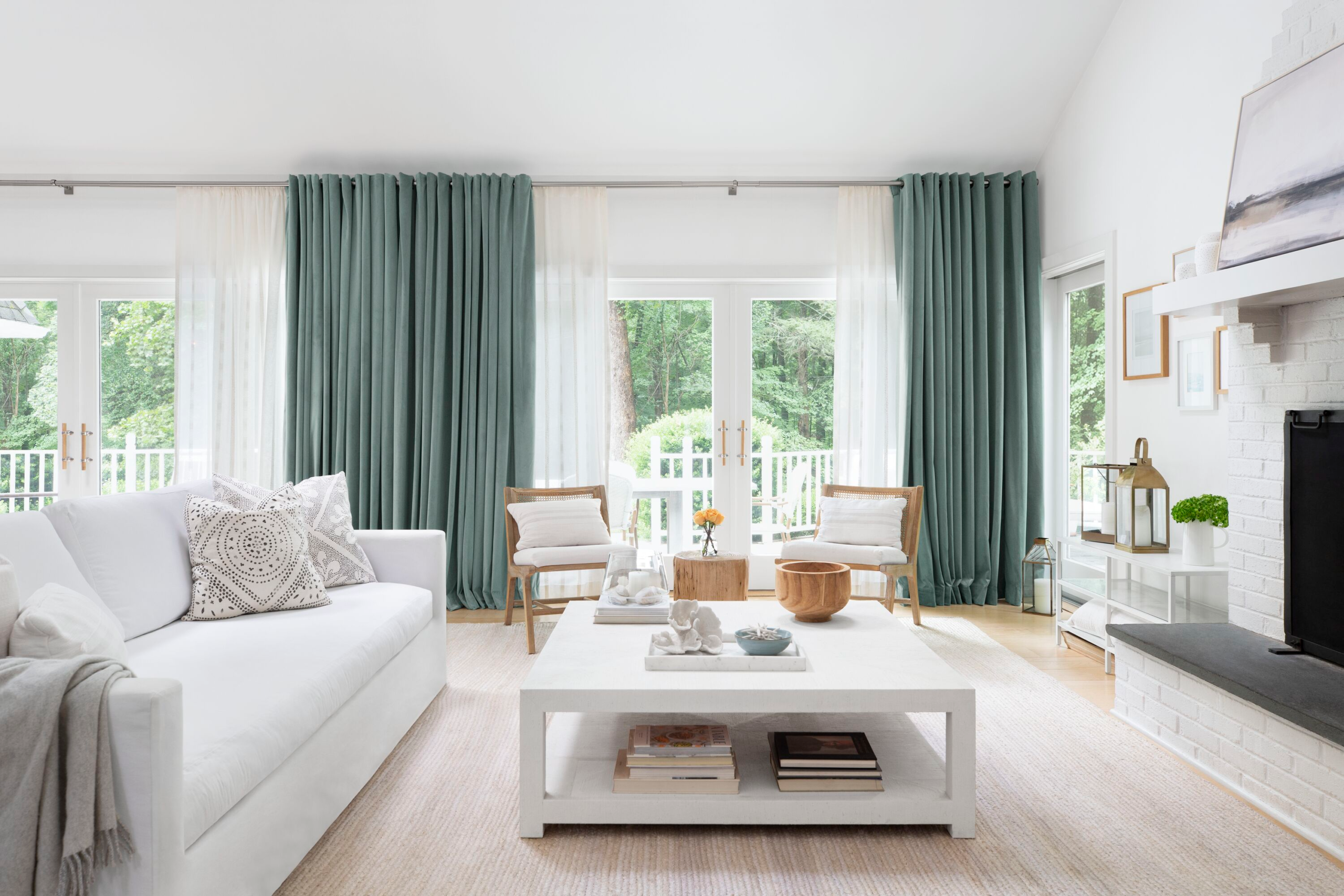
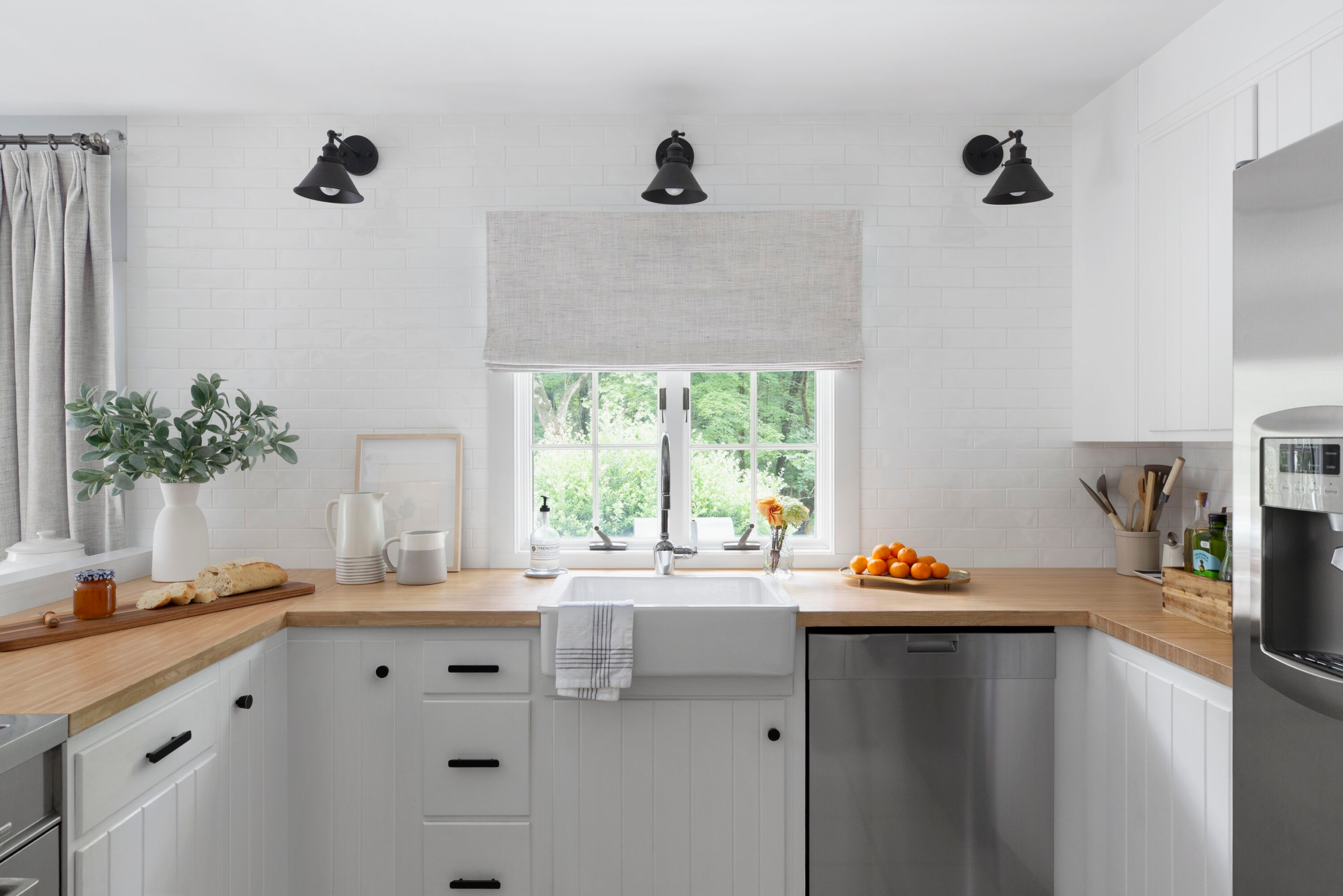
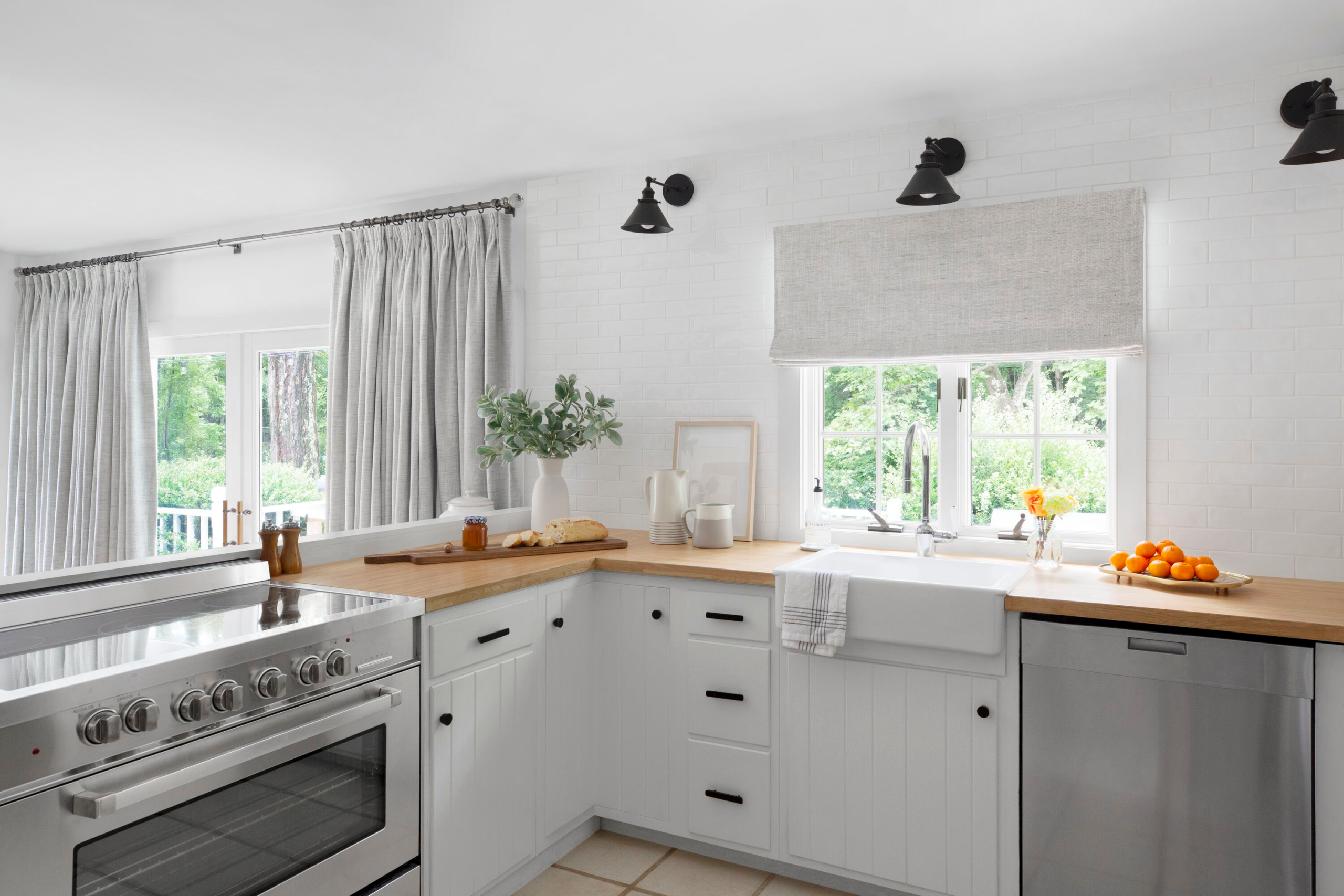
Shop by Room
User selects a room — Kitchen, Living Room, Bedroom, Kids Room, Bathroom — rather than navigating abstract product categories.
Previous Experience
Generic category browsing left users struggling to understand how products would fit their actual space.
Design Insight
Users want to visualize how products look and function within their specific environment — not sort through abstract product types.
Solution
Introduced room-based navigation with contextual landing experiences (e.g., Kids Room) showcasing relevant products, safety features, and material guidance.
Abstract categories
Room-first navigation
Contextual discovery
03
Product Detail Page
User selects a product. The PDP is designed to build decision confidence in a made-to-order, final-sale environment where returns are not an option.
Previous Experience
Dense information and competing customization options created cognitive overload. Users couldn't distinguish between product types — blind vs. shade, for example.
Solution
Reorganized content hierarchy to prioritize decision-critical information. Simplified layout, grouped customization into progressive sections, and protected primary CTAs from competing modules.
Cognitive overload
Progressive hierarchy
Clear product context
Protected CTAs
04
Step-by-Step Customizer
User configures their order through a structured, progressive flow. One decision at a time — each step revealed only after the previous is completed.
Previous Experience
All configuration options were presented simultaneously. Too many buttons, no clear sequence — complex steps increased abandonment risk significantly.
Solution
Introduced progressive disclosure to prevent simultaneous decision overload. Structured steps logically with real-time visual previews to reinforce confidence at each stage.
Simultaneous overload
Progressive disclosure
Visual previews
Reduced abandonment
05
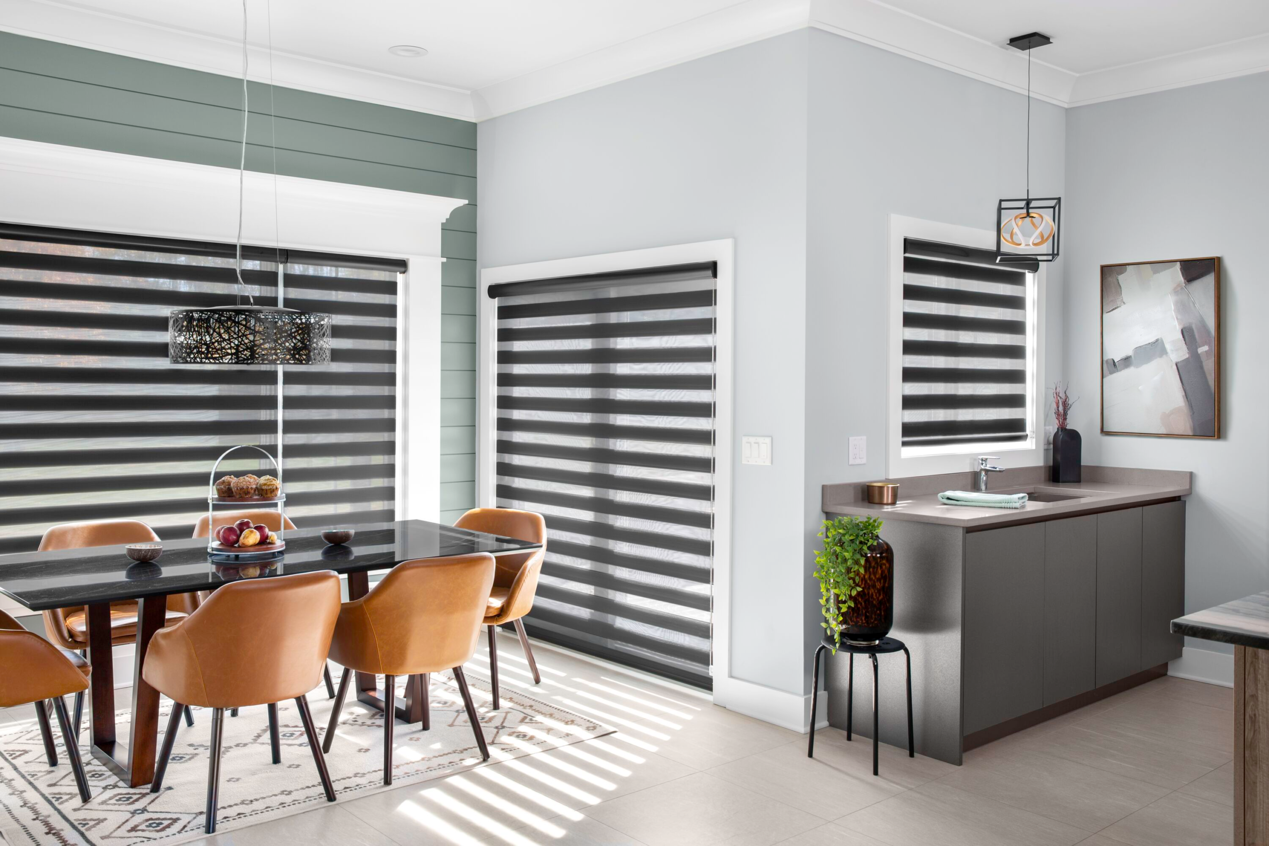
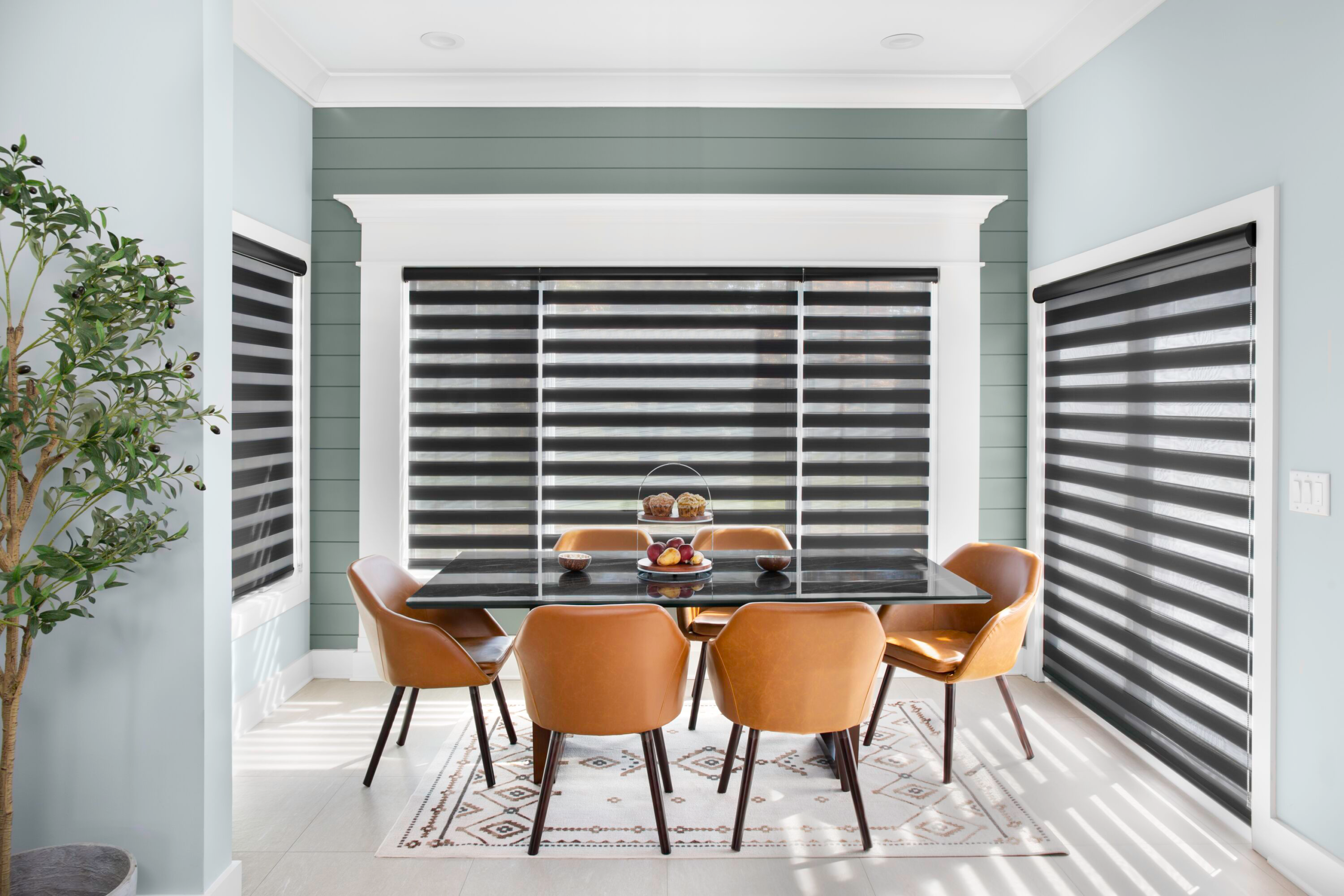
Cart — Order Review
User reviews their fully configured order before committing. Every customization spec is surfaced clearly — making it easy to verify each decision before a final-sale purchase.
Style
Color
Width & Height
Panel Style
Opening Type
Privacy Liner
Mechanism
Mount Type
Collection
Full spec transparency
Pre-commit confidence
06
Delivery & Designer Review
User selects delivery method — Free In-Store Pickup or Delivery to Address — then is offered a free designer review before the order enters production.
Key Trust Signal
"Review with Designer (FREE)" — a safety net unique to the final-sale model. Gives first-time buyers confidence that an expert will catch any errors before production begins. Cannot be modified once submitted.
✓ Yes — Review with Designer
Expert checks order before production. Maximum confidence for a first-time buyer.
→ No — Submit Directly
Confident returning buyer or DIY shopper proceeds using the Order Checklist.
Free designer review
DIY order checklist
Final confidence check
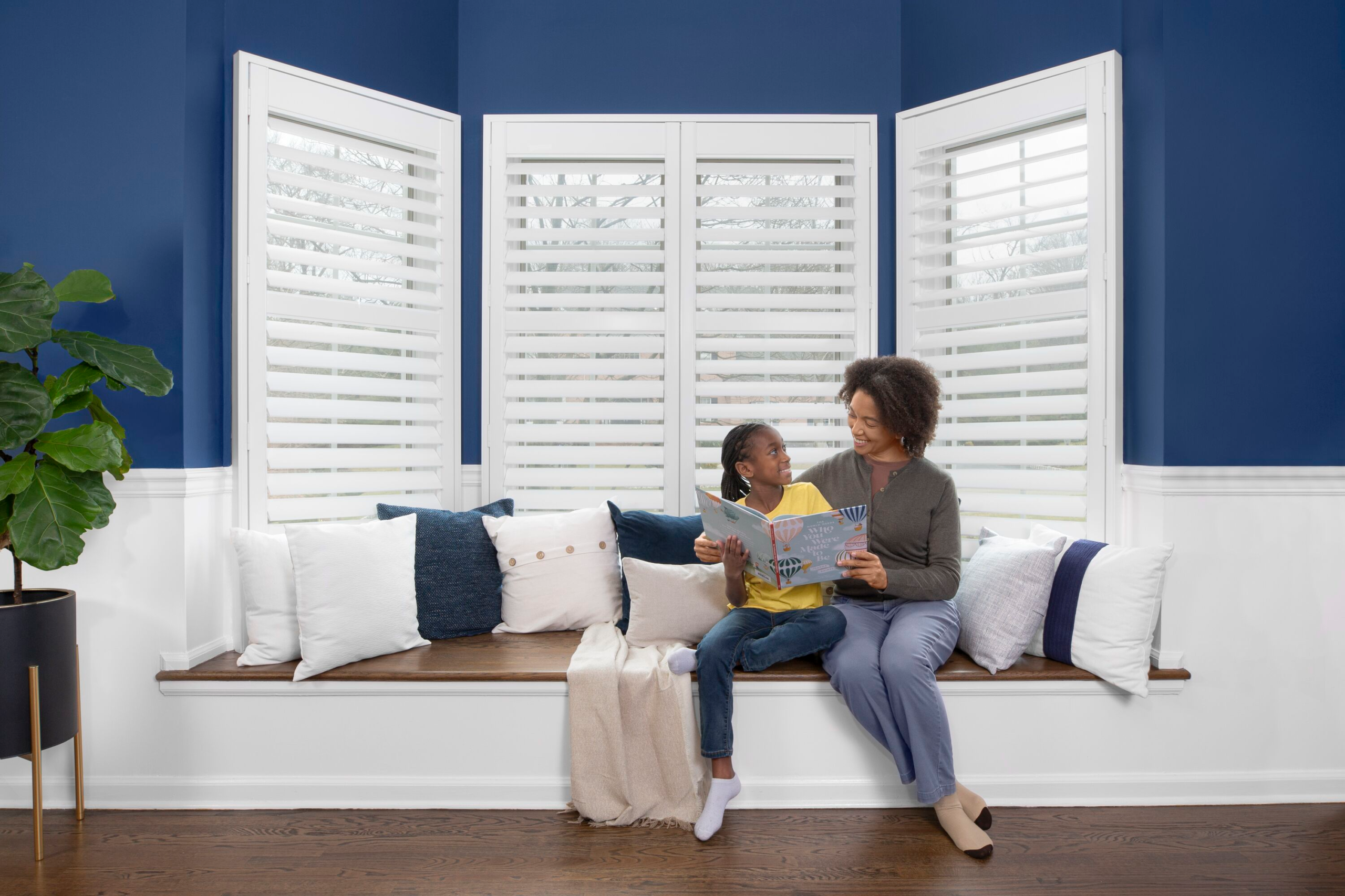
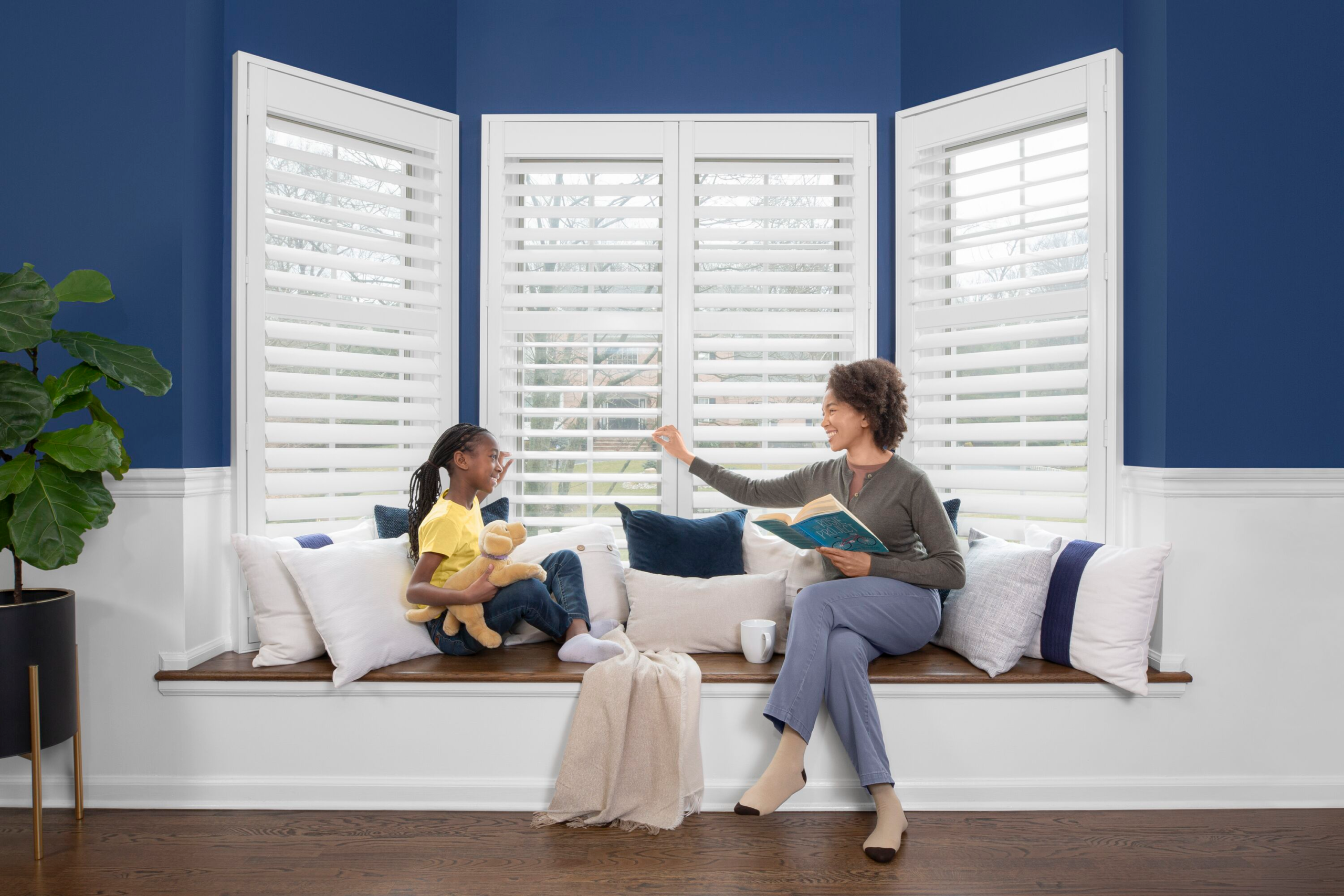
Order Placed — Confident First-Time Buyer
A customer who arrived knowing nothing about blinds or shades has made a fully customized, final-sale purchase — without confusion, intimidation, or drop-off. Education was built into every step of the journey.
+1.1%
Add-to-cart rate improvement
+75%
Product page clarity improvement
8
Guided steps vs. one overwhelming screen
4
Clear homepage entry points established